
TIME TO LIVE
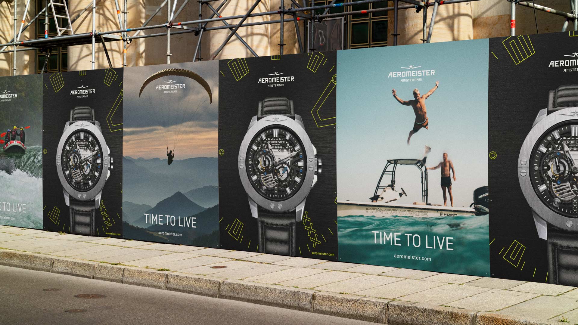
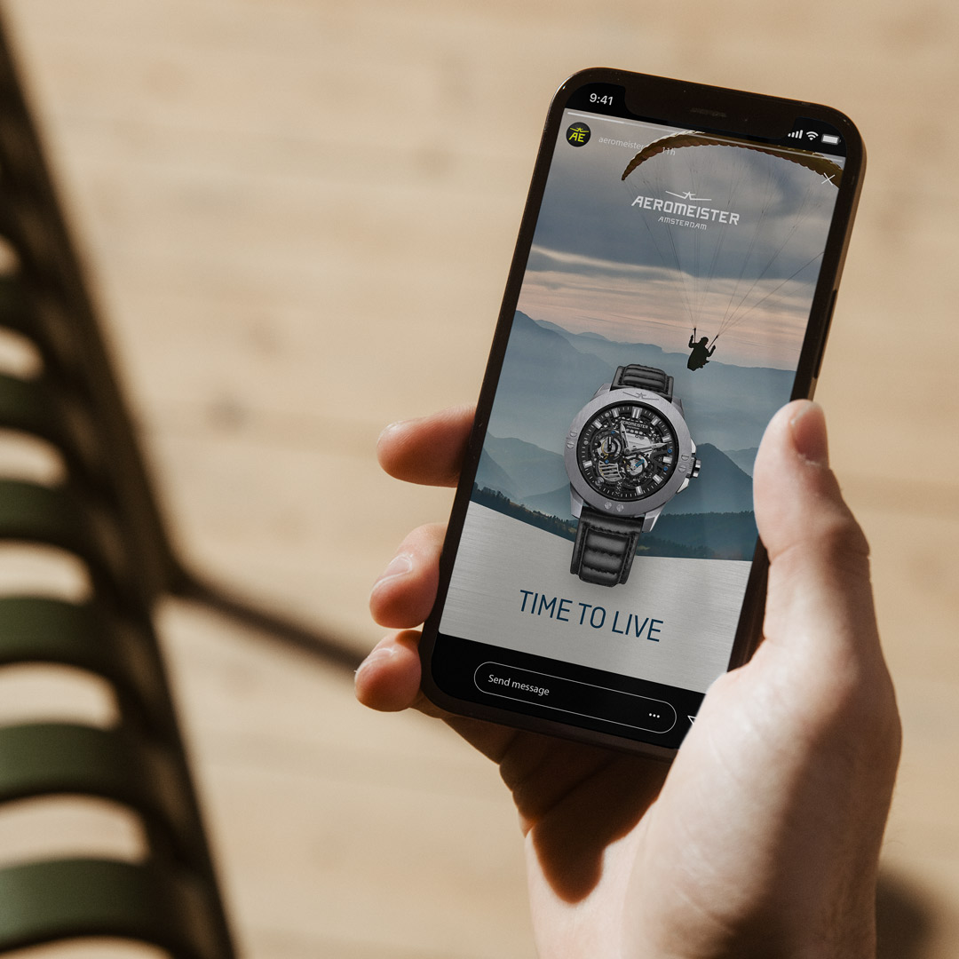
For AEROMEISTER — a start-up watch brand — everything evolves auround enoying life to the fullest with your friends.
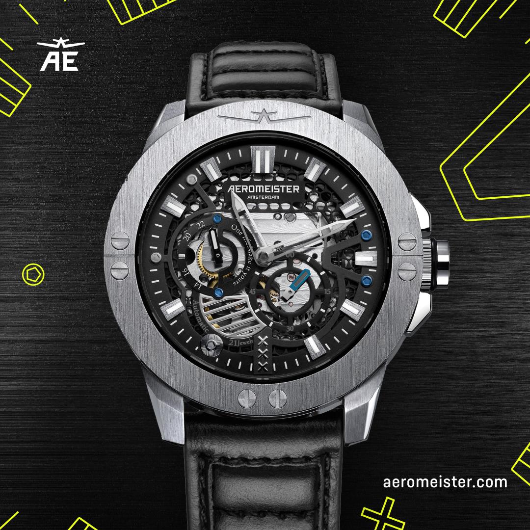
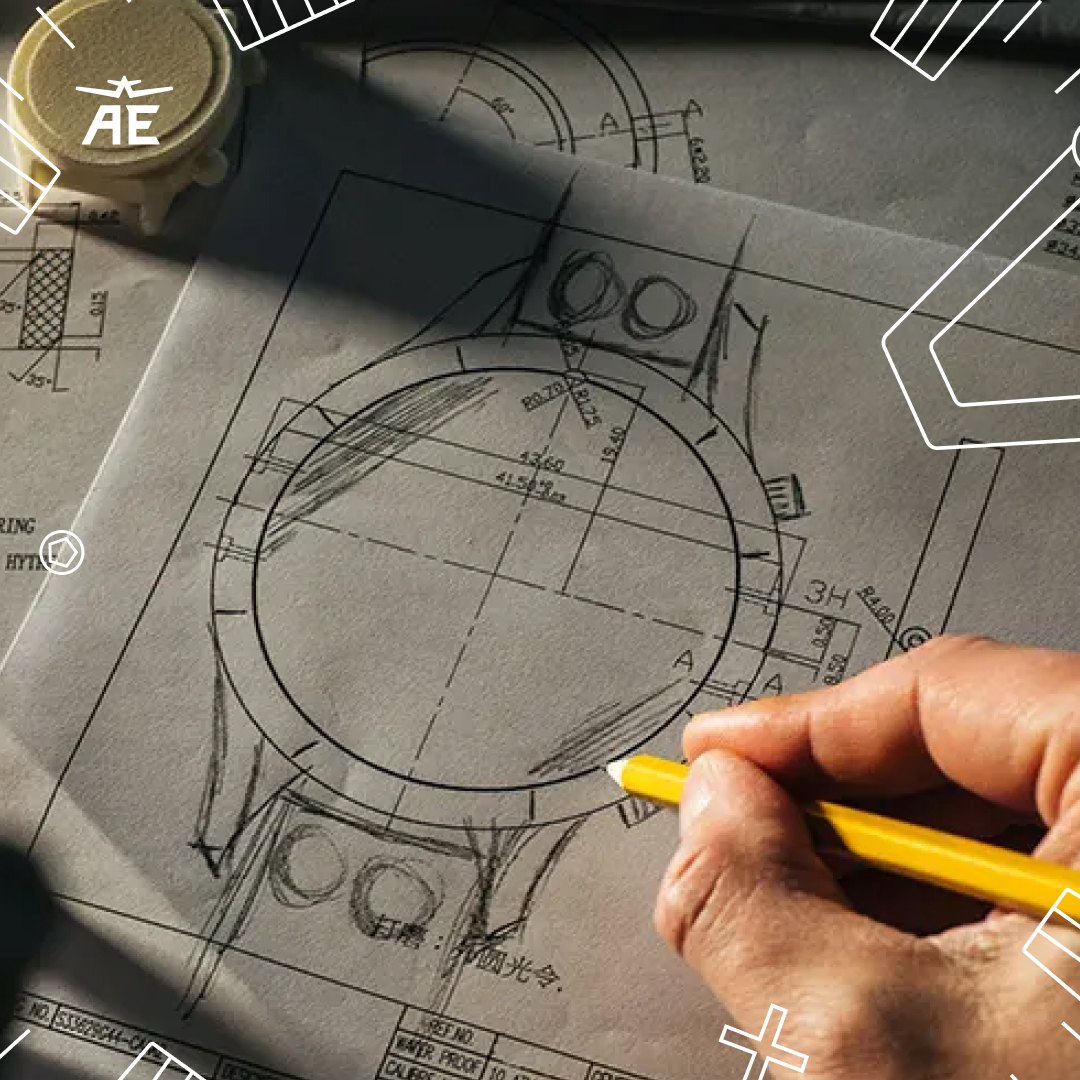
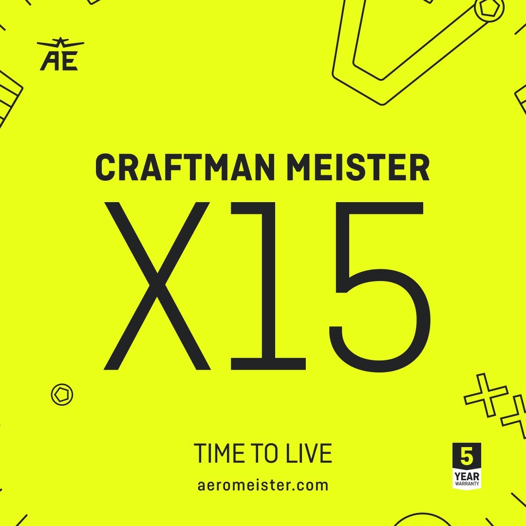
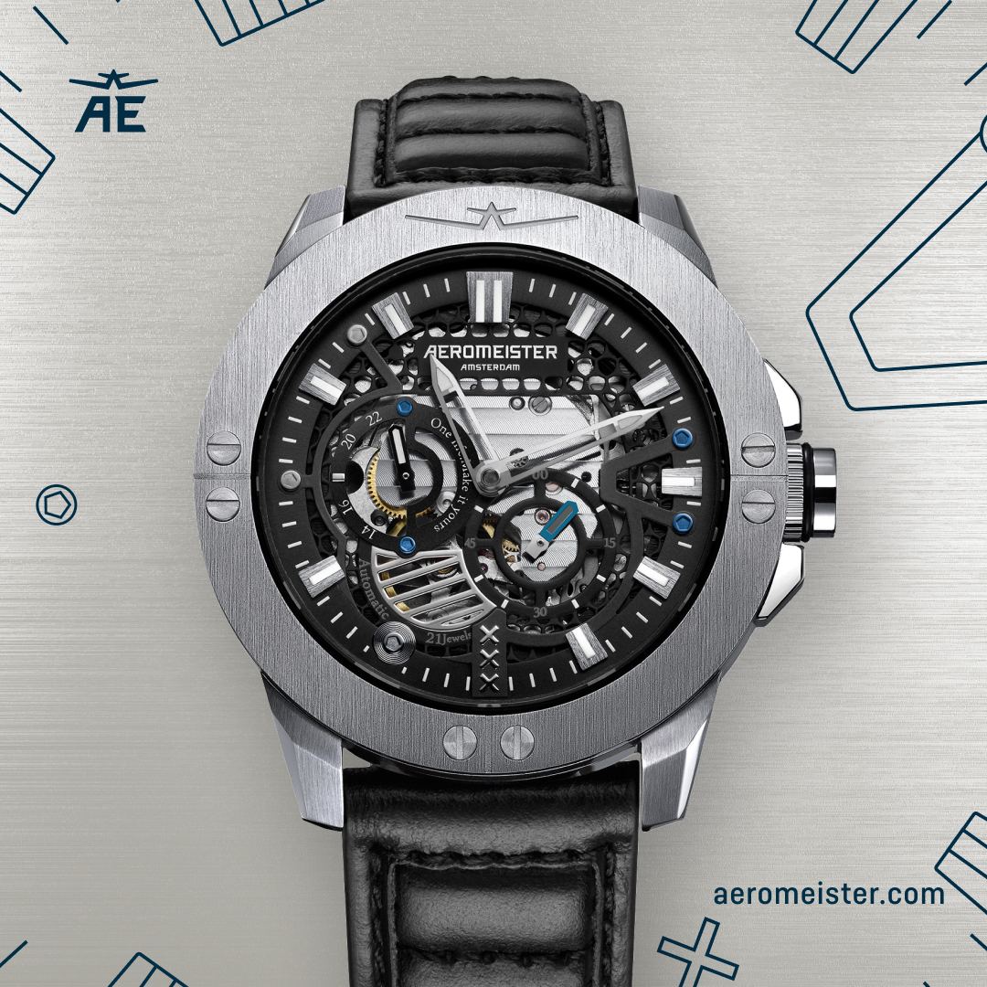
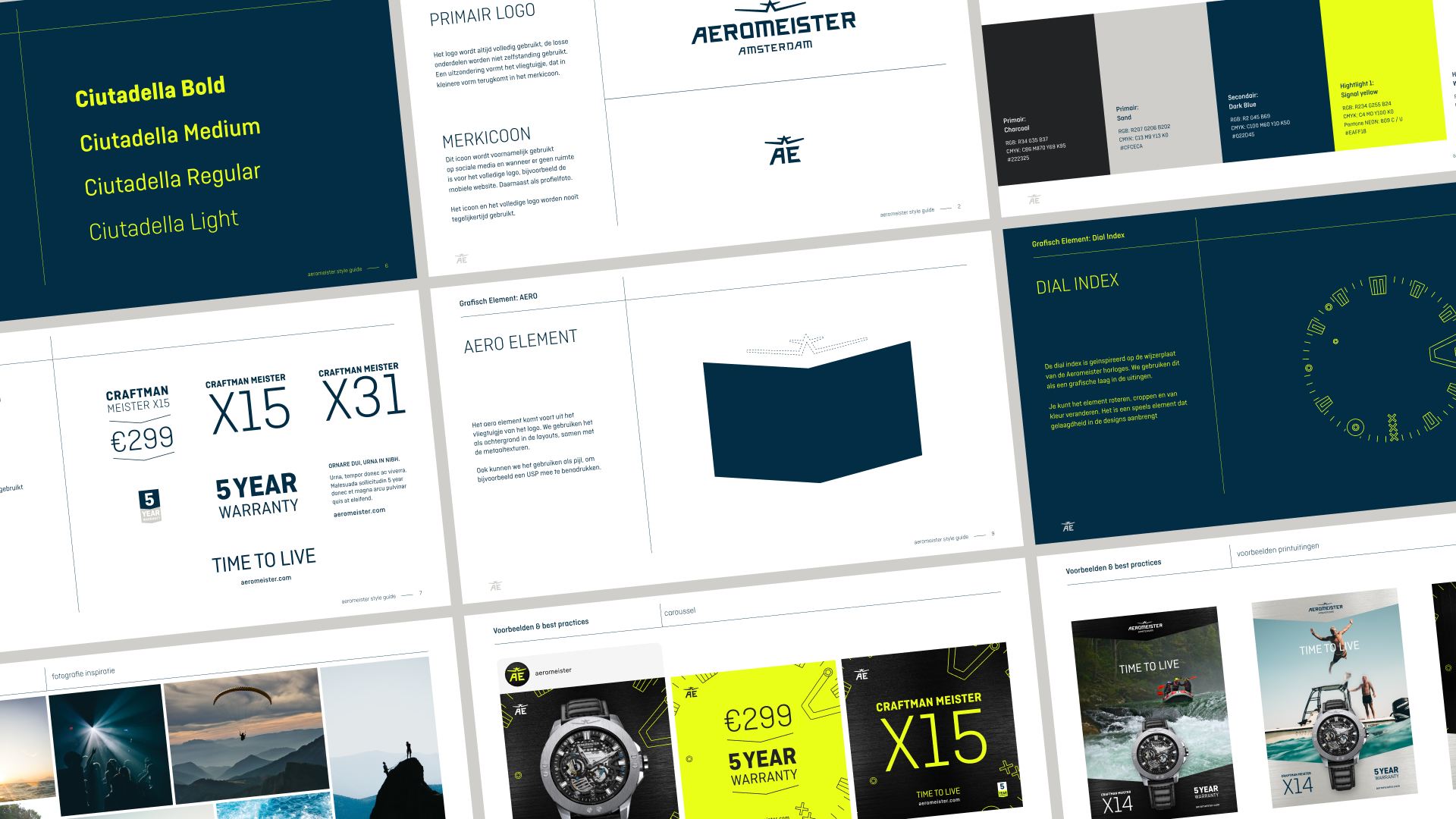
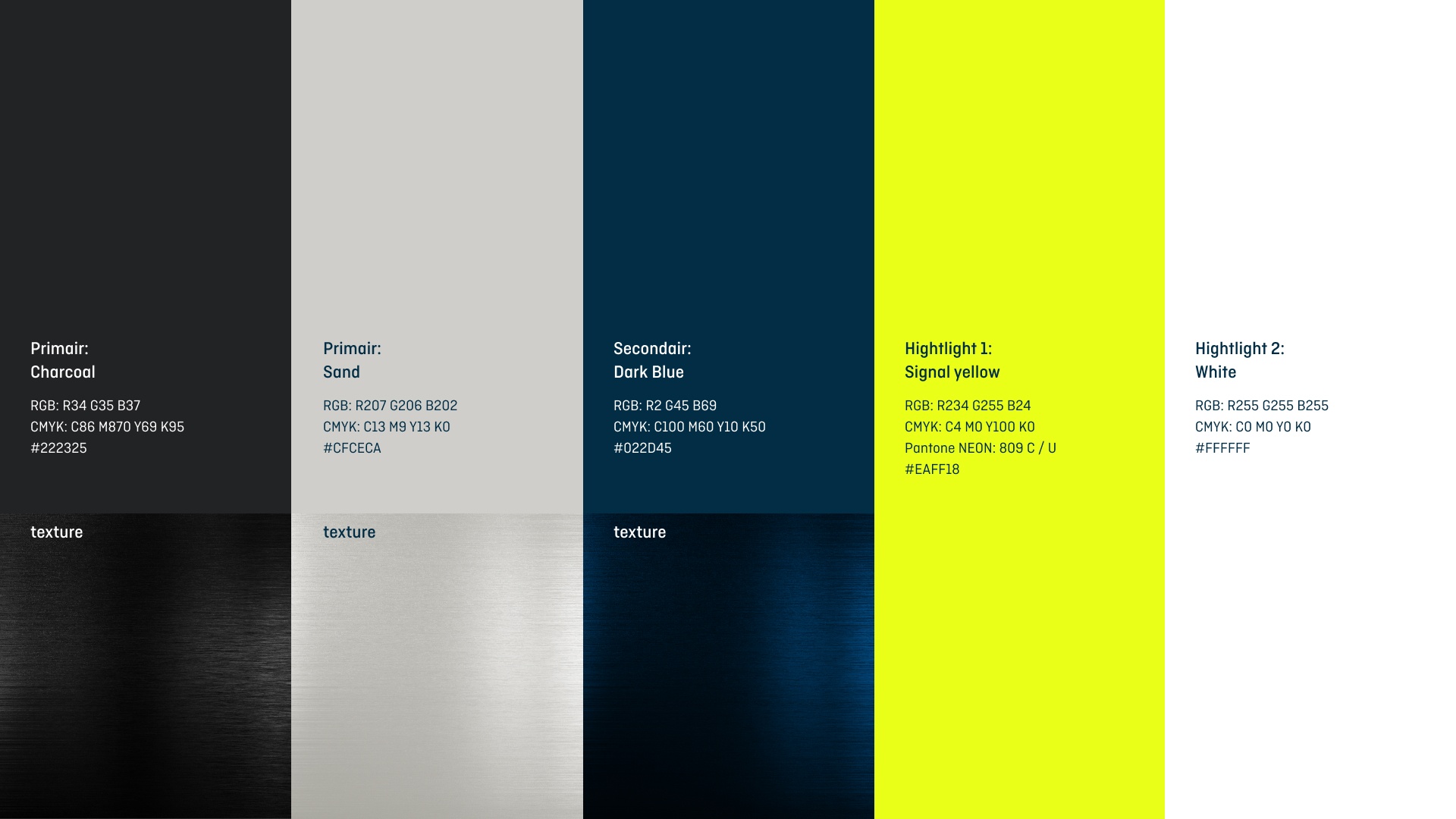
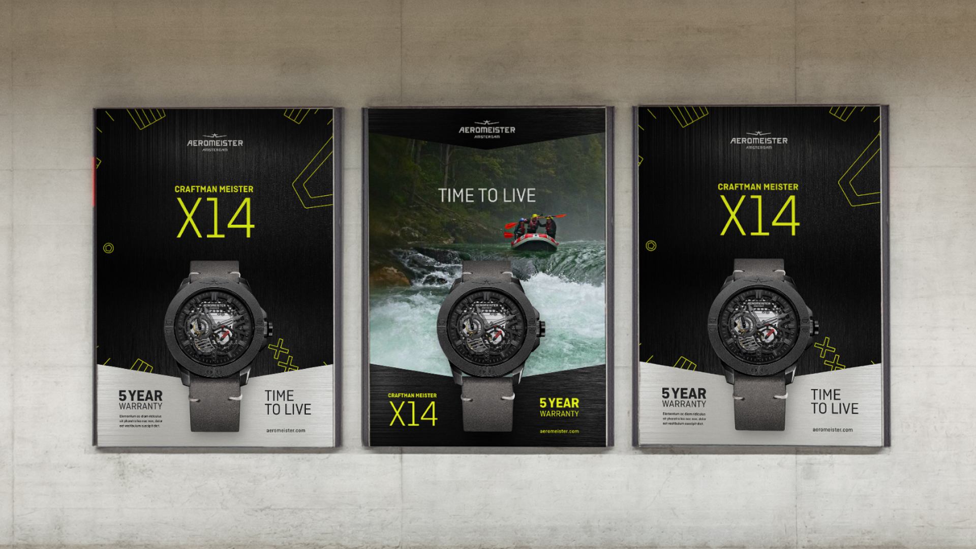
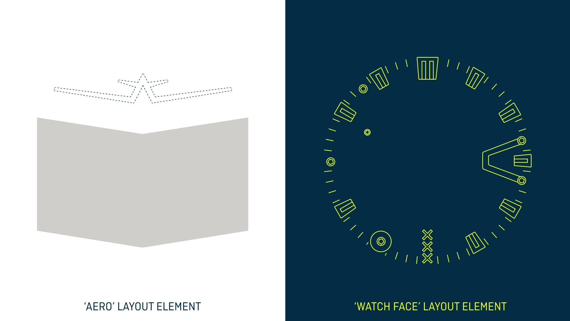
The new visual identity uses graphic elements that are inspired by the watch index and logo shape. An updated colour palette — including a puchy yellow that contrasts the sophisticated metal textures — helps to stand out in the crowd.
TIME TO LIVE
For AEROMEISTER — a start-up watch brand — everything evolves auround enoying life to the fullest with your friends.
The new identity uses graphic elements that are inspired by the watch index and logo shape. An updated colour palette — including a puchy hi-viz yellow that contrasts sophisticated metal textures — helps to stand out in the crowd.

+ Rebrand
+ Creative Direction
+ Visual Identity
Client
Aeromeister
Creative Direction, design
Simon van de Rijdt
Strategy
Michiel Vogels, Mark van der Werff
Copy
Martijn de Vreeze
Account & PM
Lifehunters
Client
Aeromeister
Creative Direction, design
Simon van de Rijdt
Strategy
Michiel Vogels, Mark van der Werff
Copy
Martijn de Vreeze
Account & PM
Lifehunters
Simon van de Rijdt
Creative Direction & Brand Design