AHOY Rotterdam — Rebrand
My role
Creative Direction
Design Direction
Project outline
Brand Identity
Brand Design
Client
Ahoy Rotterdam
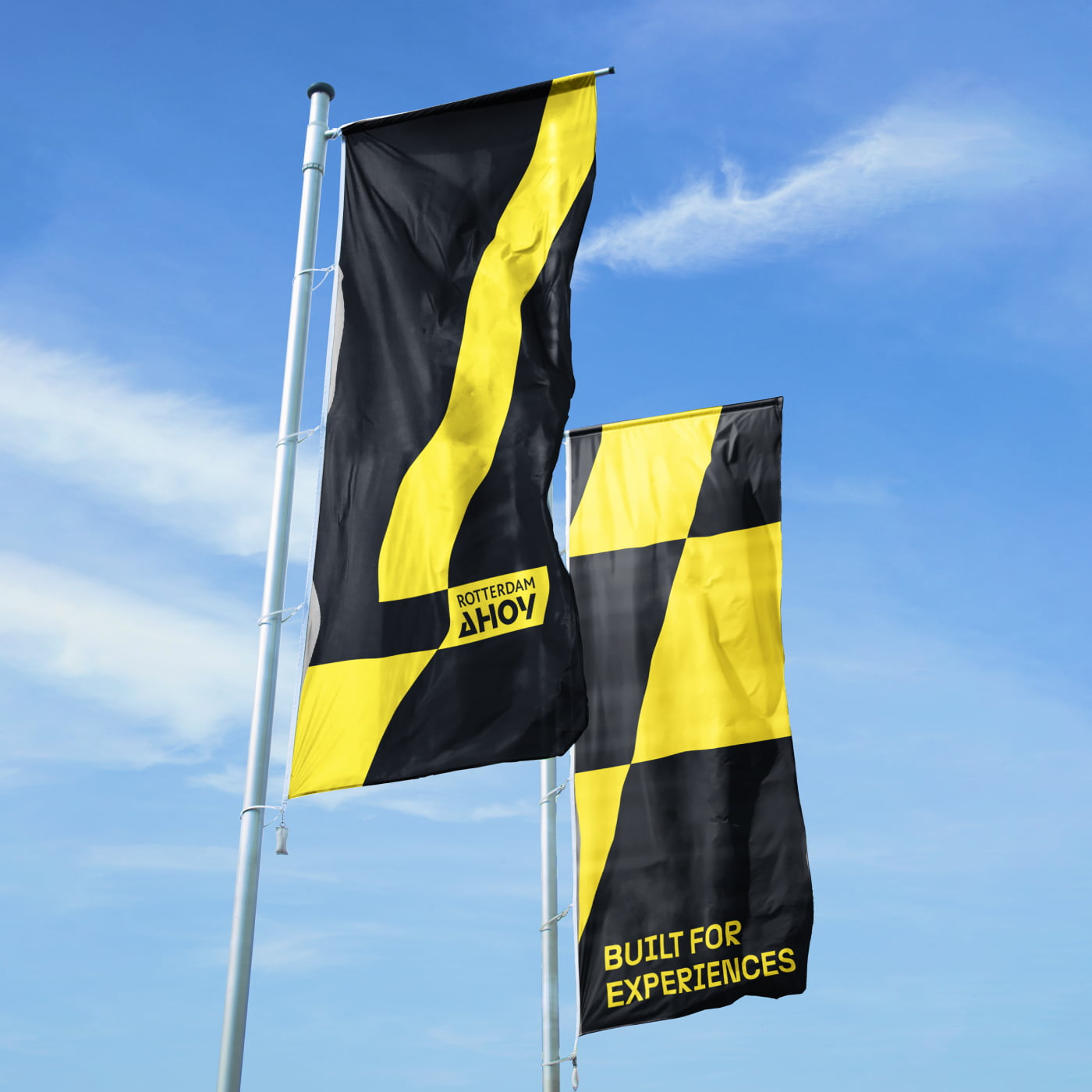
Built for experiences
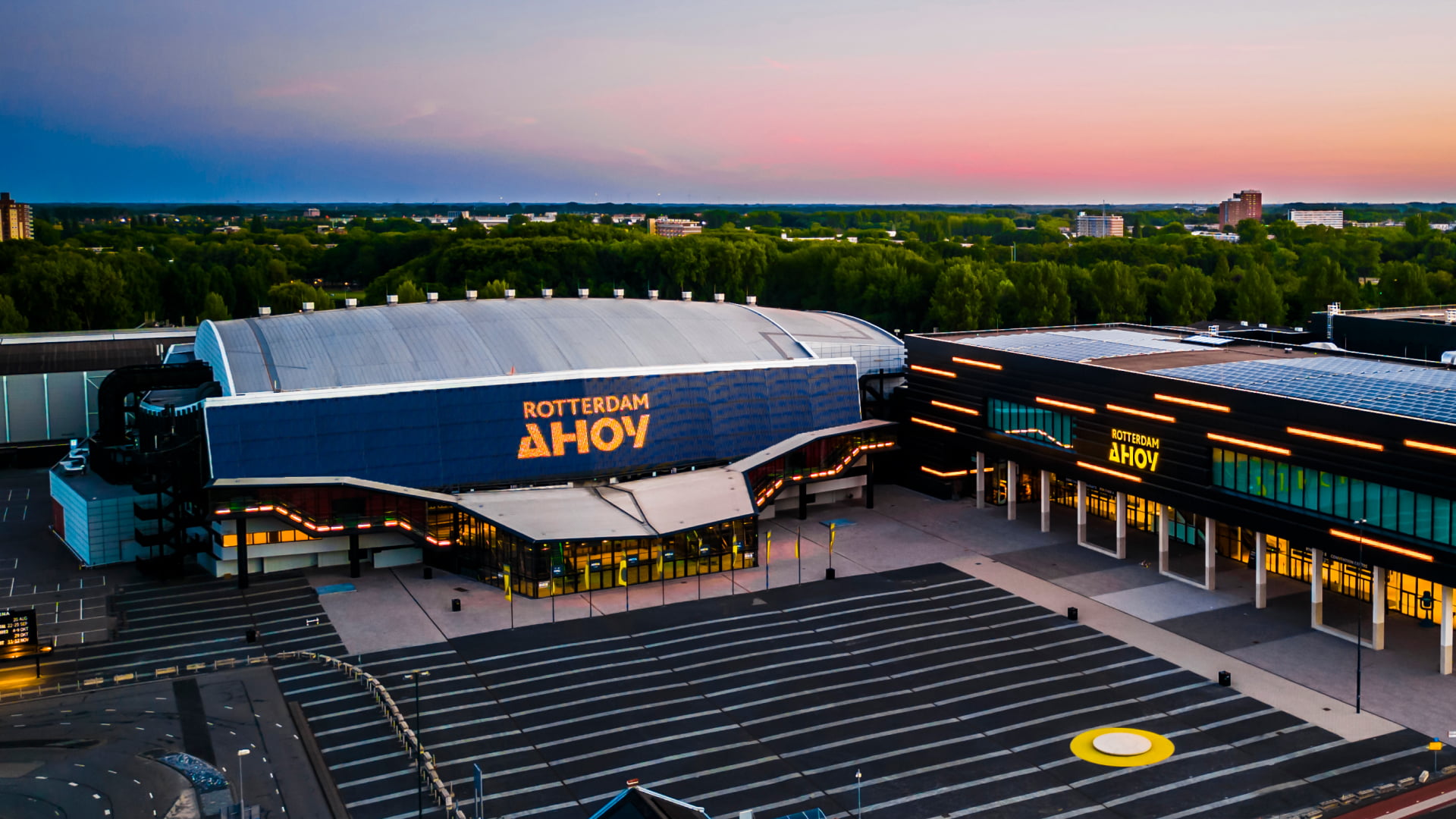
Ahoy is an iconic venue in the city of Rotterdam and The Netherlands. For well over 50 years it has been a leading centre for entertainment, sports and conventions.
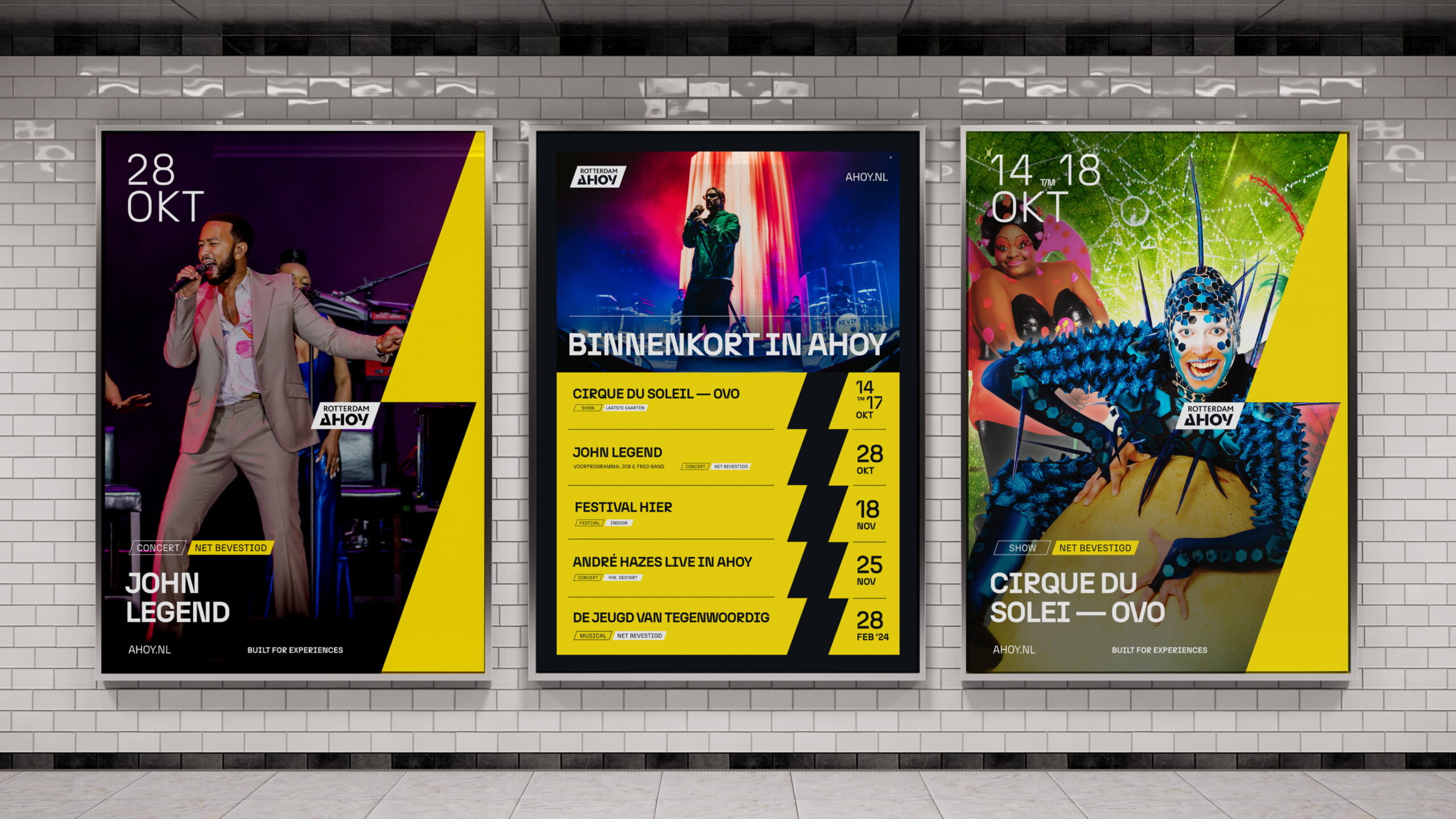
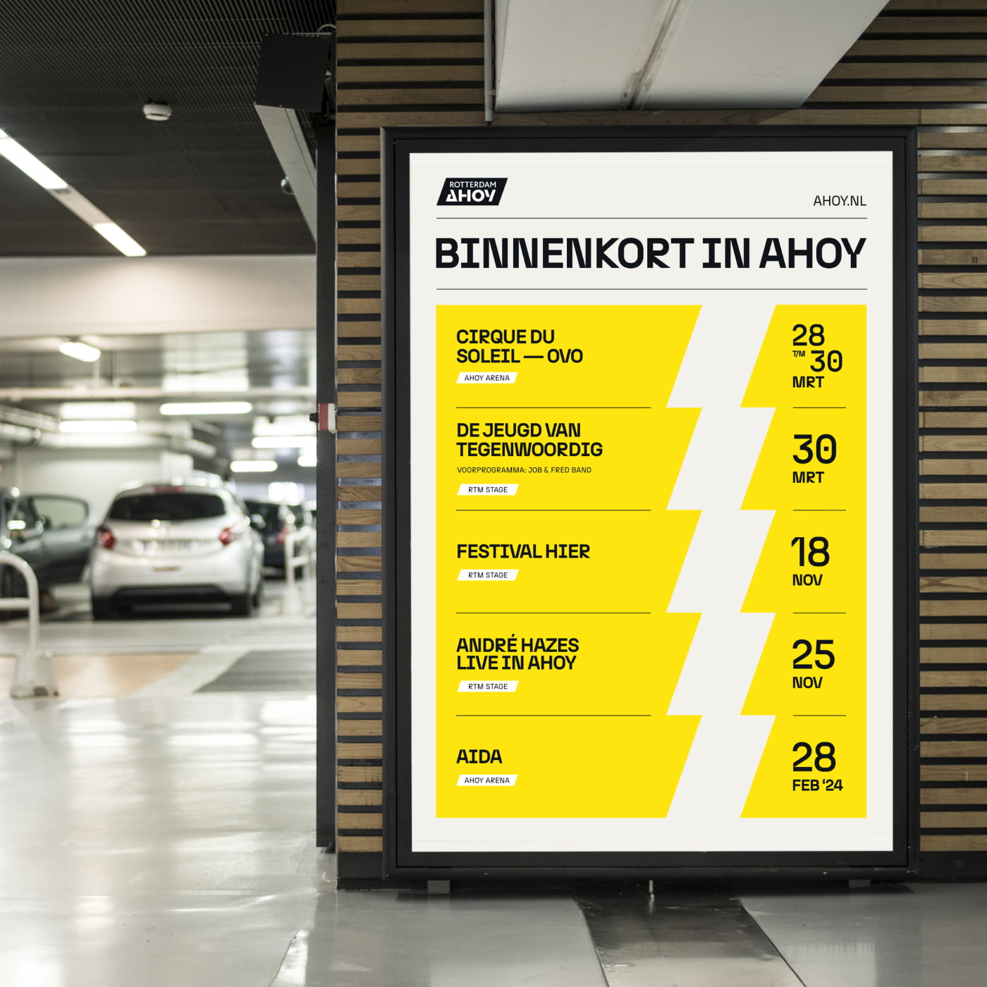
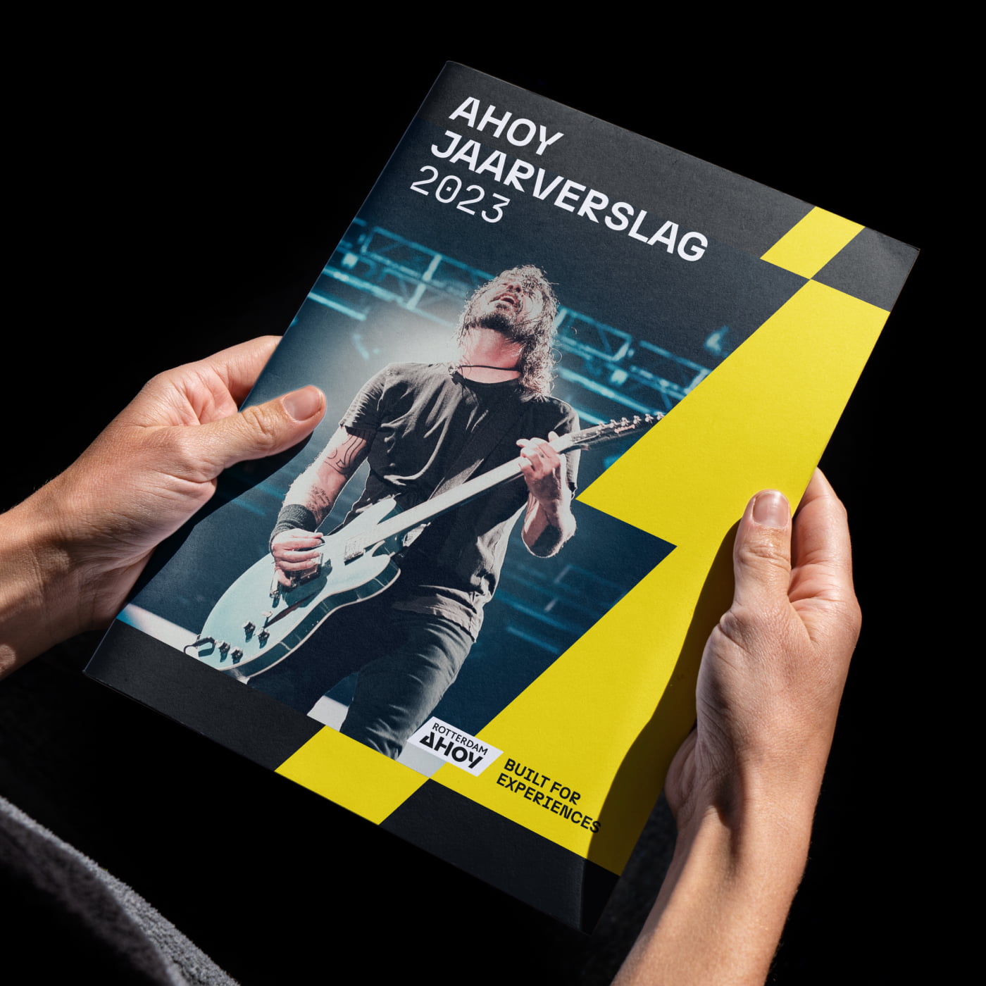
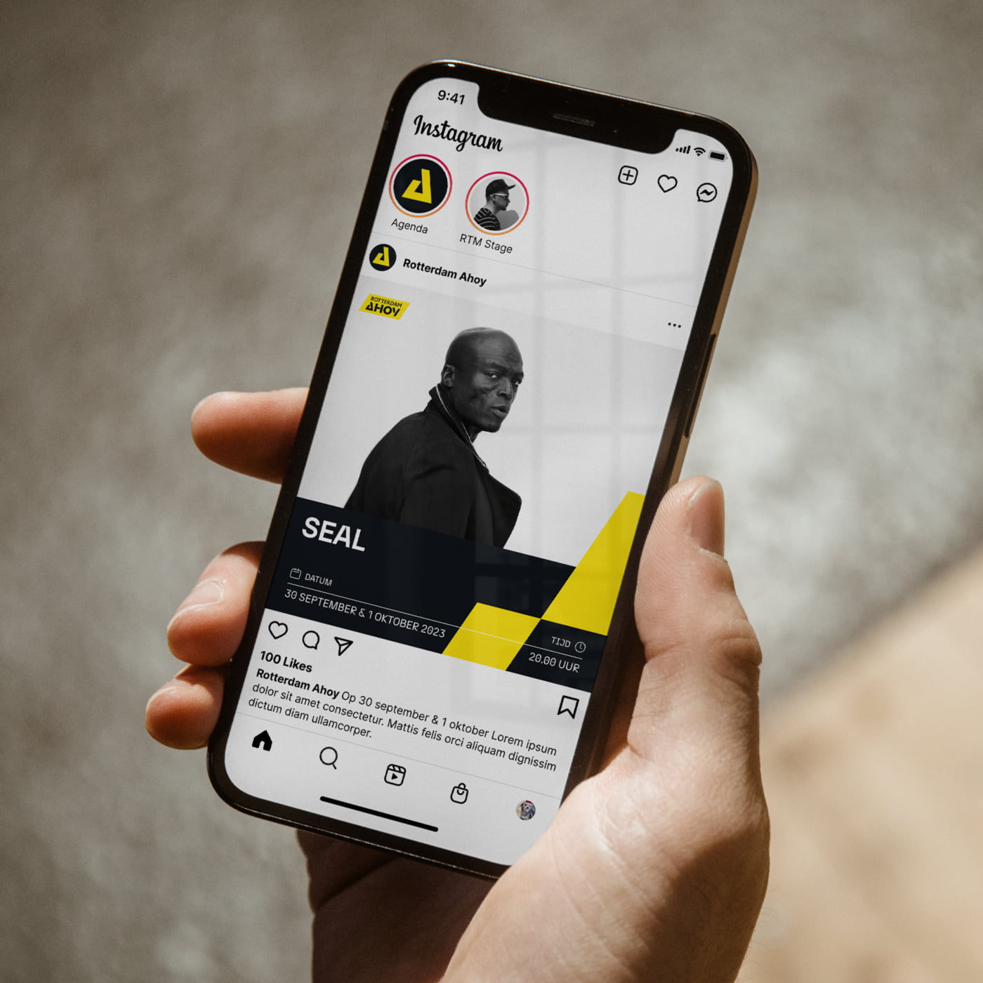
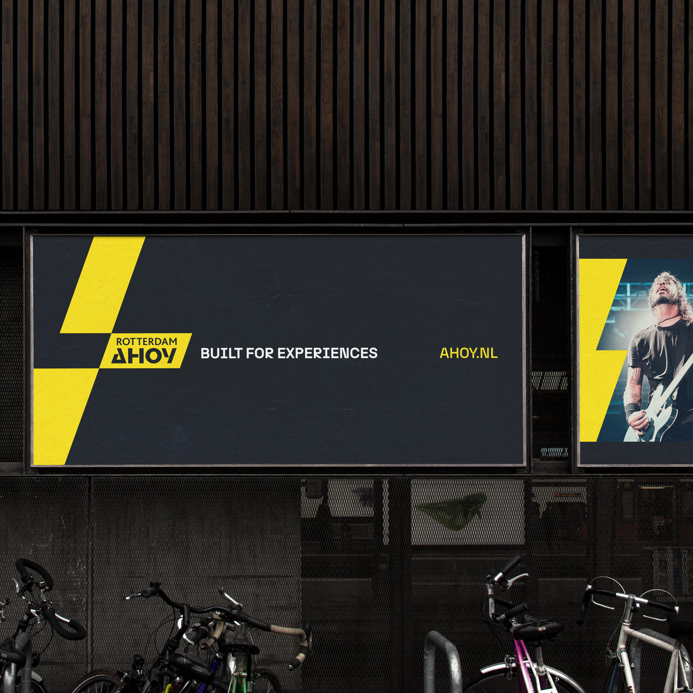
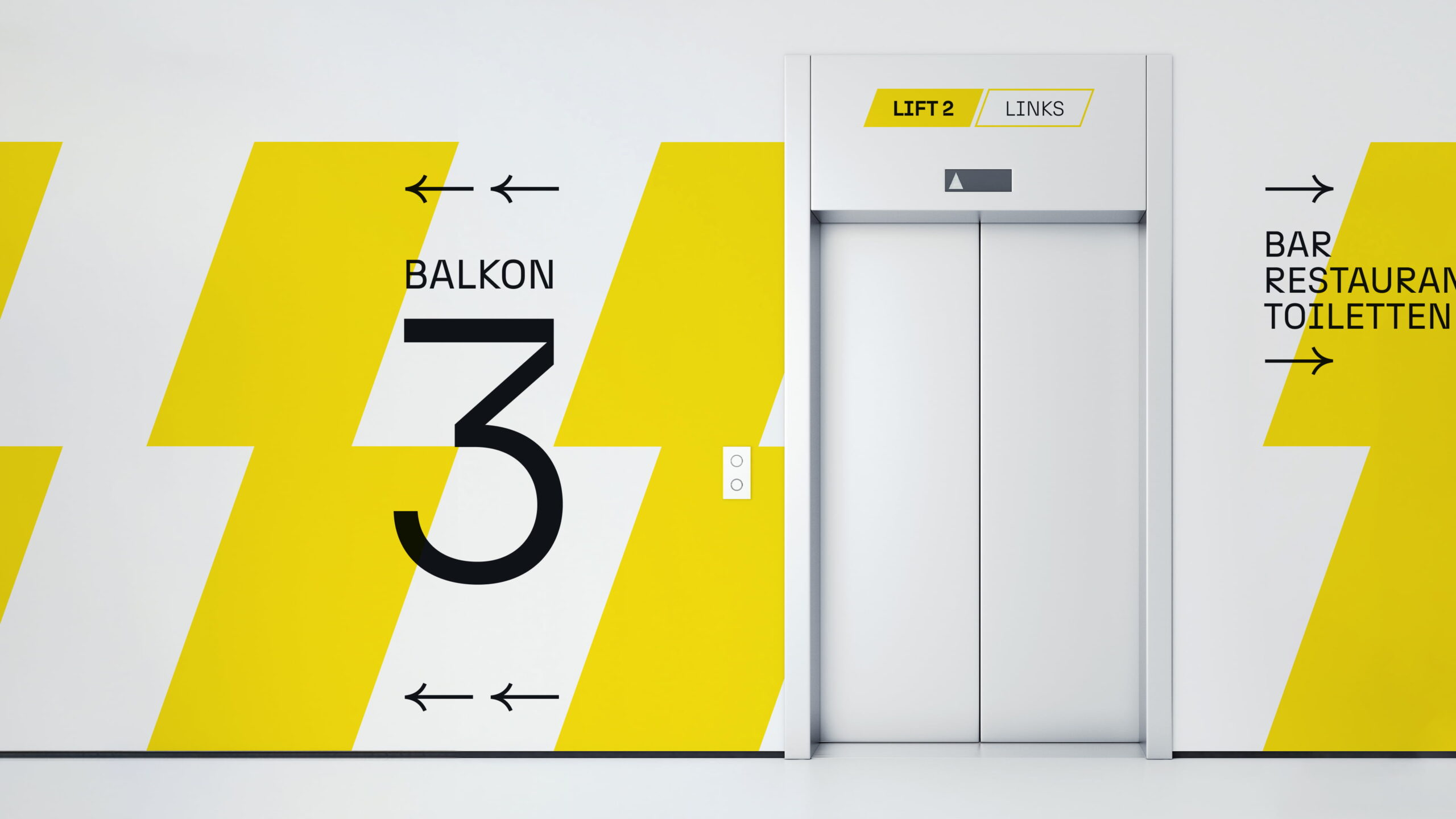
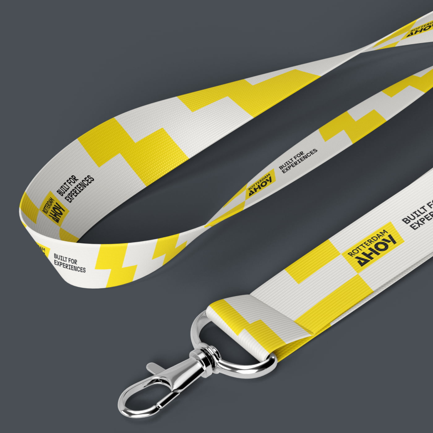
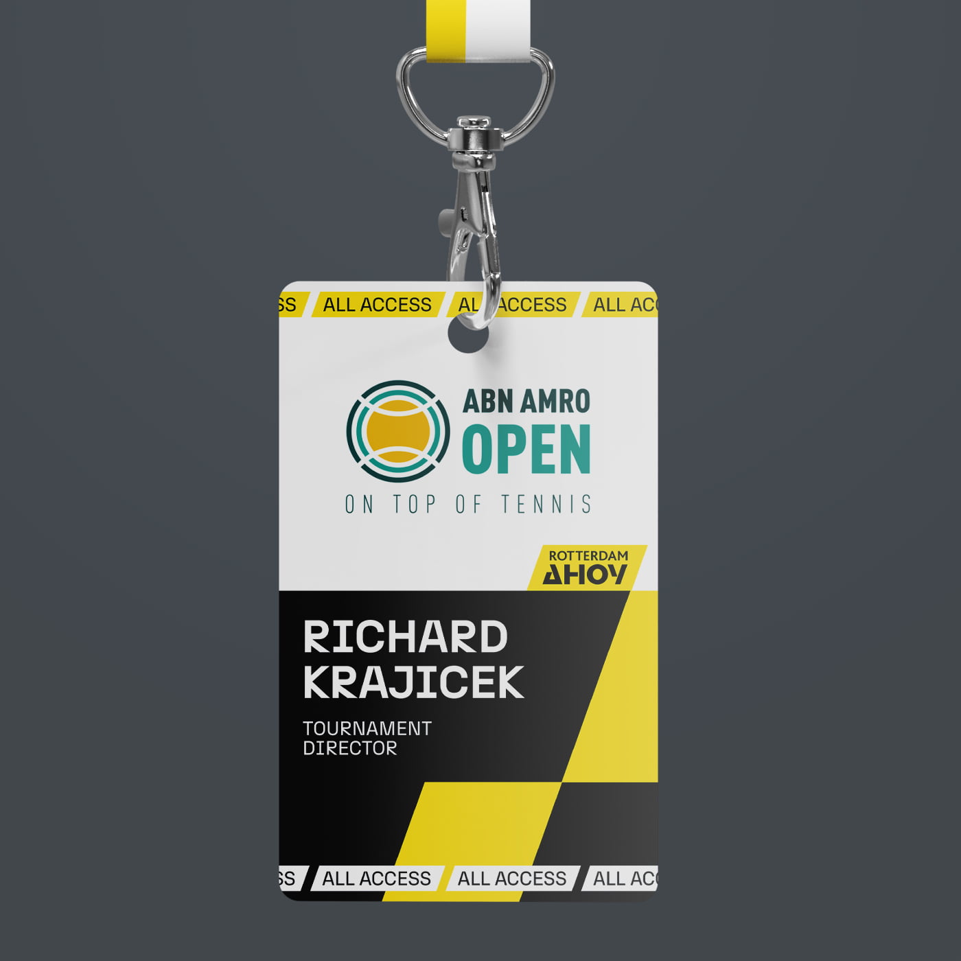
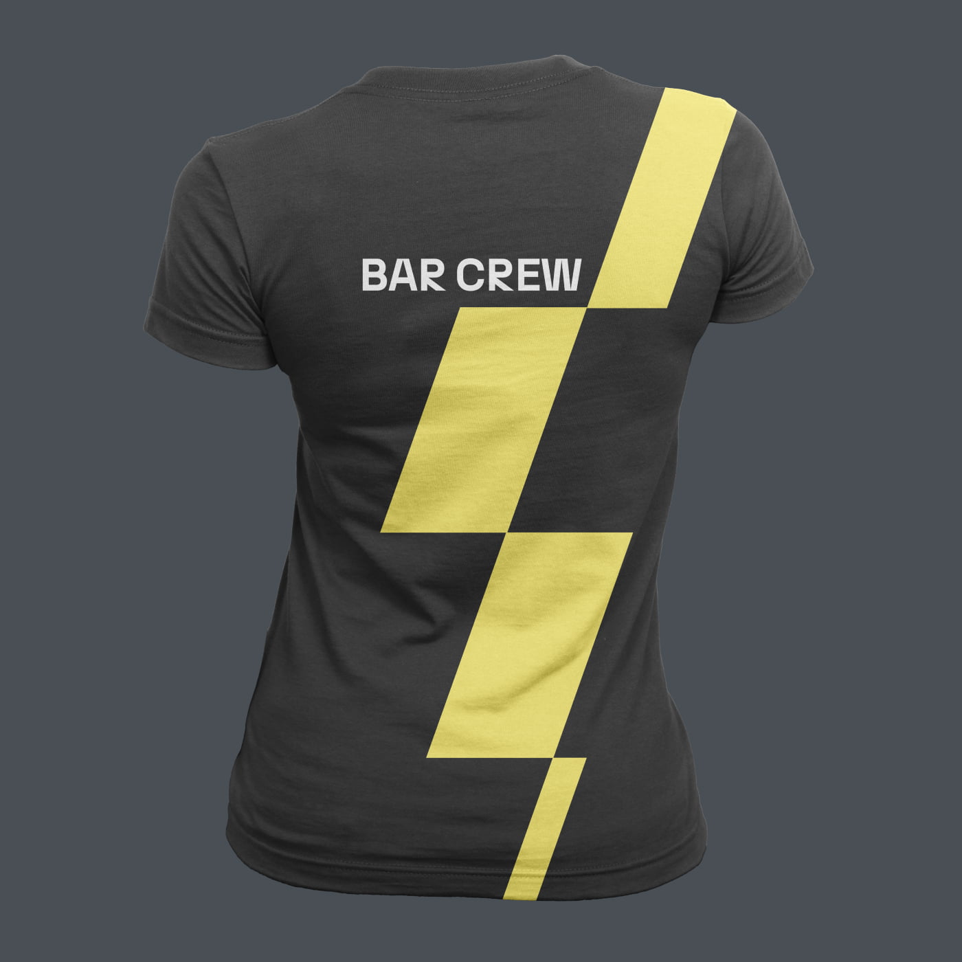
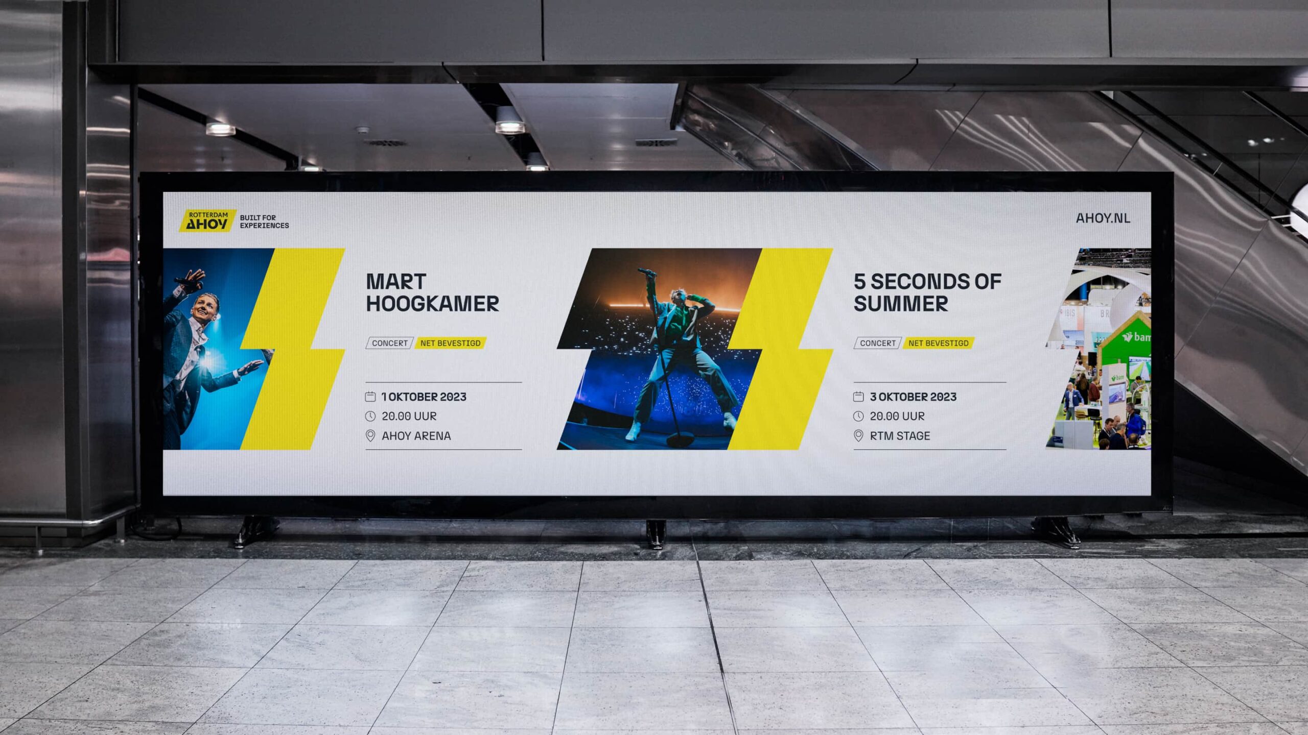
The new brand identity of Ahoy is powerful and authentic — important elements contributing to this are the strong and recognisable typography plus a graphic system stemming from the diagonals in the logo.
It provides the ability to create both creative and more corporate expressions without compromising the brand's recognizability. This allows Ahoy to cater to different communication styles and needs, depending on the context or purpose.
The new visual identity and updated logo ensure that, regardless of the creative freedom taken, Ahoy remains instantly recognizable as a venue truly built for unforgettable experiences.
A subtle logo update aligns all diagonal angles and creates symmetry in the letter O. The result is a well balanced logo, that fits perfectly with the new visual identity and graphic system.
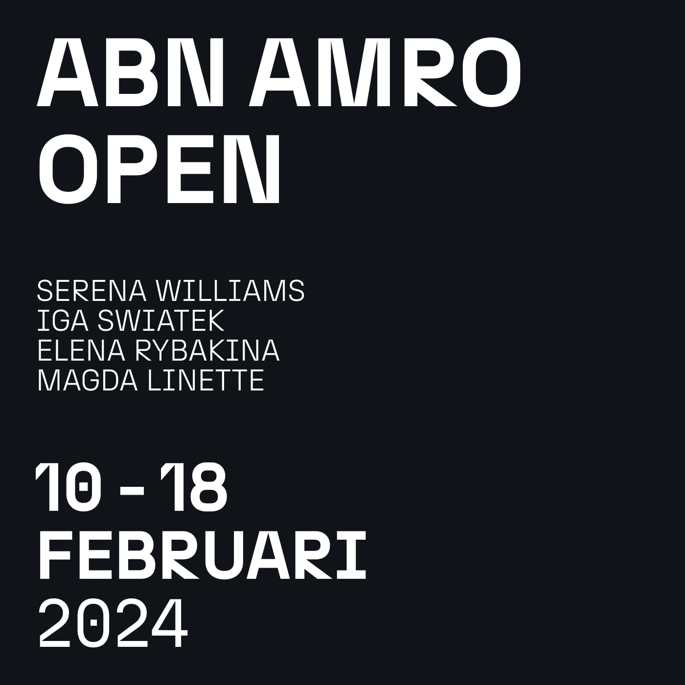
Typography
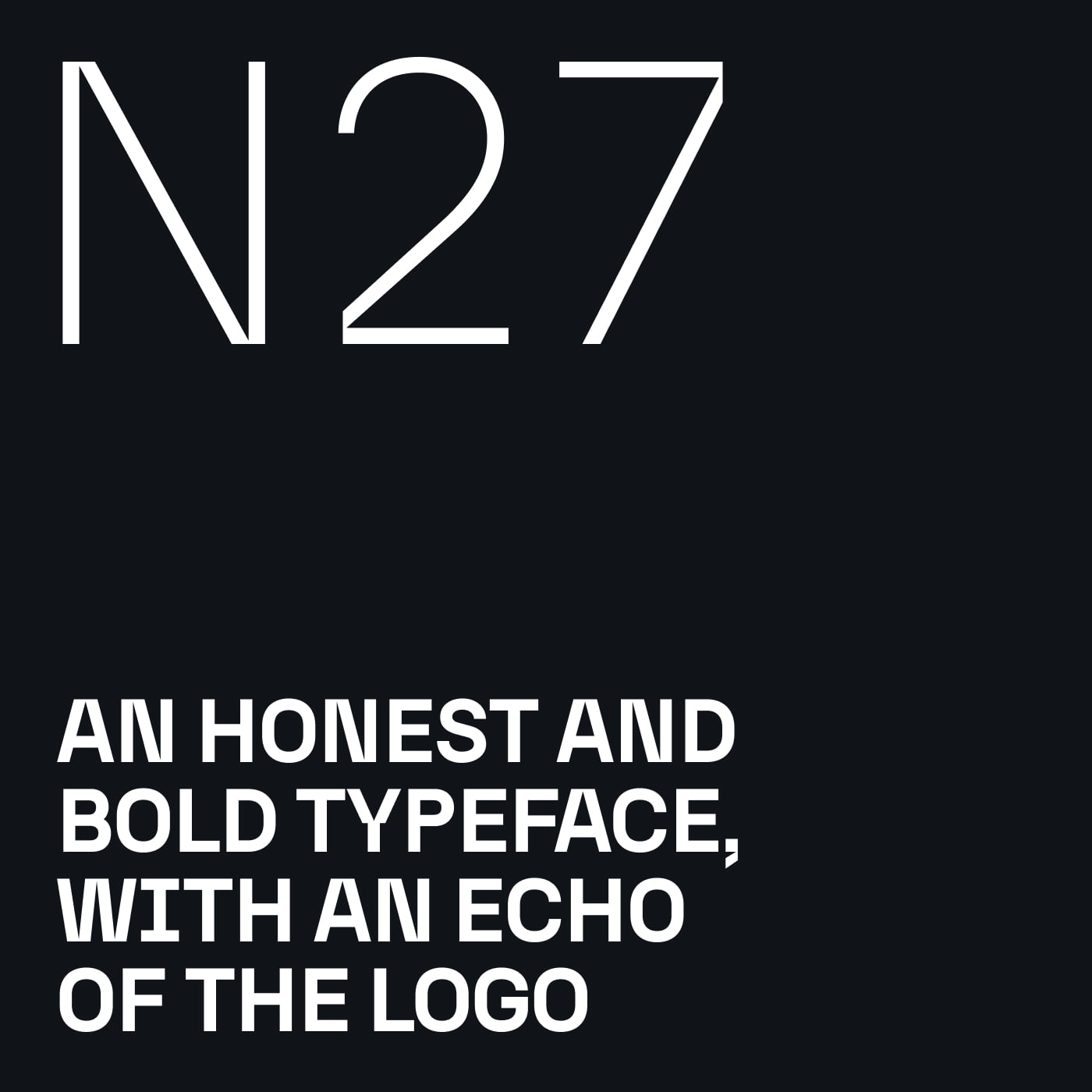
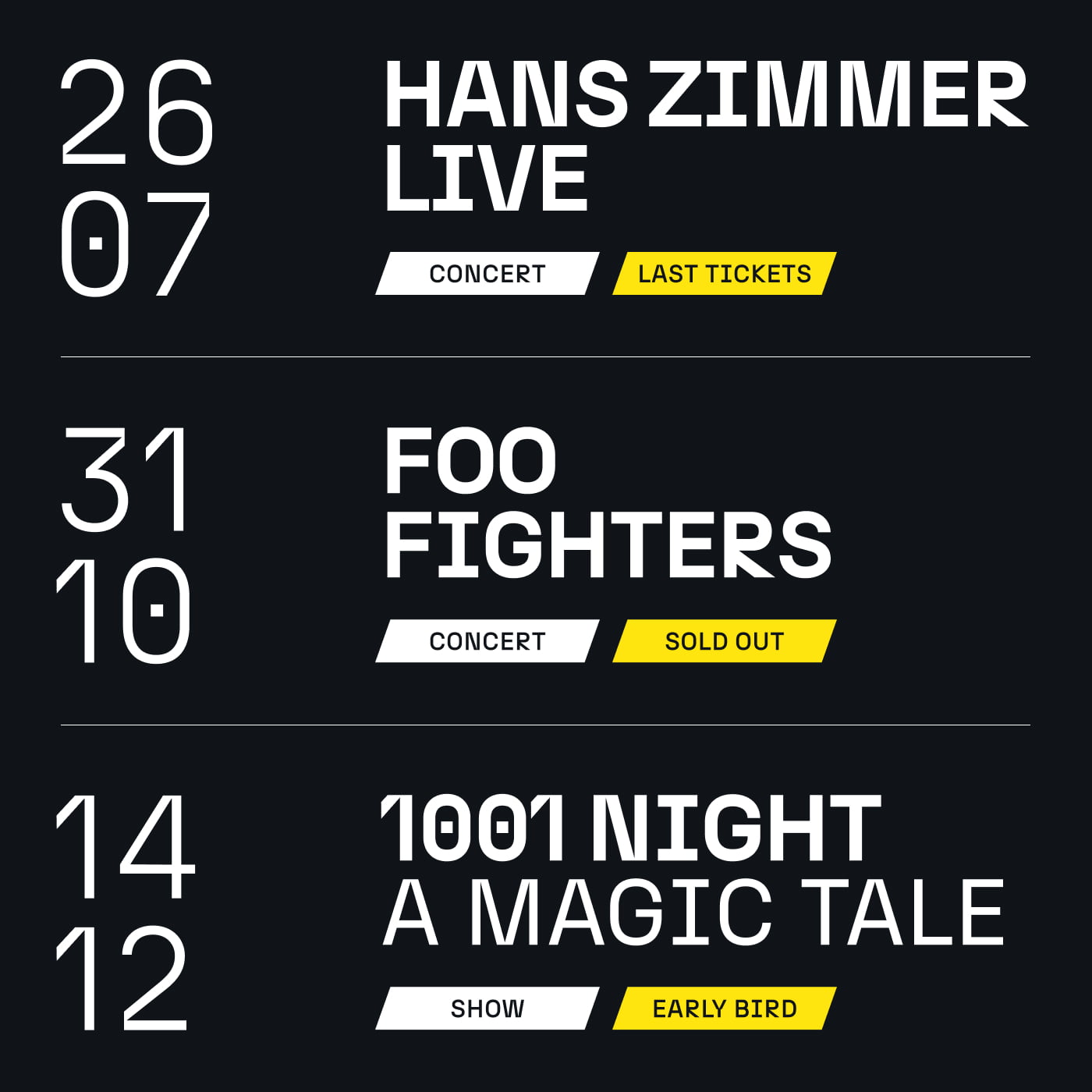
The letterforms of the N27 typeface by Atipo echo the shapes of the logotype and was carefully chosen for this specific reason. An honest, robust and characterfull typeface, creating instant recognisabillity for the AHOY brand.
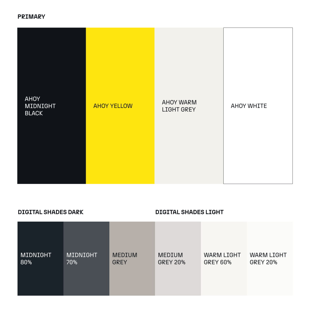
An updated colour pallette, designed to work better on digital executions. Also cutting back to four primary colours, to create a better managable brand consisitency across the board.
The building blocks for the visual system stem from the logo shape and are used to create a flexible pattern library.
+ Rebrand
+ Creative Direction
+ Visual Identity
+ Brand Toolkits
+ Social Media Toolkits
Client
Rotterdam Ahoy Marketing & Communications
Susanne Blaas
Creative Direction
Simon van de Rijdt
Design
Gino van Lierop, Simon van de Rijdt
Project Management
Crisja Ran
Client Agency & Key Account
XYZ Creative Agency / Diederik Hoffland
Simon van de Rijdt
Creative Direction & Brand Design